
Green Day’s third album, Dookie, turned 22 earlier this month. 22! To put that into perspective, I was not quite 3 years old when it was released. (Apologies if you bought it when it was first released and I have now made you feel really old!) I discovered Green Day about ten years after that and, although by no means a very favourite of mine or a band I listen to all that often any more, I know that Dookie is a classic. It was the album that first made the band known in the mainstream and it is one of, if not the number one (I’m not sure on facts), best-selling punk rock albums of all time. It’s also the Green Day album that I think a lot of people, punk fans or otherwise, rate most highly – just look at a handful of our Top Ten Punk Rock Influences posts and you’ll see what I mean.
It’s not only the musical content that makes Dookie such a popular album, the album artwork too is frequently discussed – both positively and negatively. It was, and probably still is really, a rather controversial album cover when it was first released. The album title itself – to put it in the most polite terms possible – means poop, so of course the artwork would be at least a little shocking.

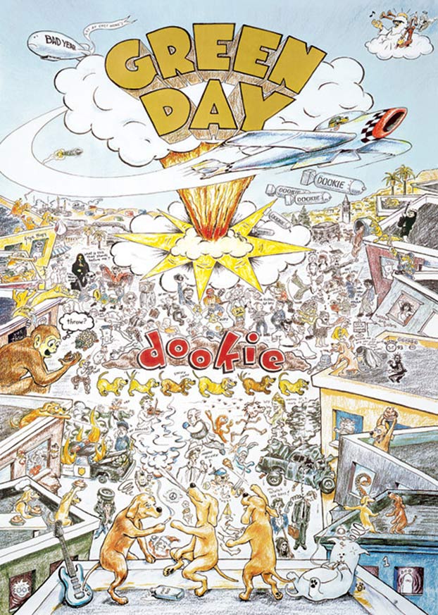
From poop-throwing dogs to bombs, there is a lot going on on the cover of Dookie and it’s drawn entirely in coloured pencils – you can’t say that about many punk album covers (I can’t think of any others right now anyway!). The [in]famous scene of chaos on Berkeley’s Telegraph Avenue was drawn by East Bay (San Francisco, California – where Green Day are also from) punk-come-artist Richie Bucher. Green Day pretty much said he could do what he wanted with the artwork… so he did.
‘All I had to work with was that it was Green Day and the album was called Dookie’, he said. ‘I used to listen to the Kerplunk! album all the time, and the first two songs especially just sounded to me like a fighter plane swooping down. That was the way in for me, the anchor for building the rest of the drawing. They didn't give me a lot of guidance, which was nice, and I just sketched out the basic design and brought it to them. Once they approved the sketch, I went back and fleshed it out with the crazy stuff in my head.’ (Willamette Week)
Bucher was also asked to ‘extend’ the artwork into a poster format by Green Day’s record label. Which he states, and I certainly agree with, would have been a lot easier to do the opposite way around – ie. cropping a poster down into album-sized artwork. I’m guessing the three smoking dogs taking centre stage at the bottom are a representation of the three members of the band. While the cat was apparently an icon for a band called Here Kitty Kitty that Bucher use to be a member of. He actually managed to fit a lot of his own elements into the illustration which is pretty awesome really – note his name and logo in the bottom right corner (of the original album cover) along with the number 93, for the year.
Billie Joe Armstrong, singer-guitarist of Green Day (Did I even need to say that? Everyone know who he is, right?), attempted to explain some of the meanings behind Dookie’s controversial artwork in an interview on VH1 many years later.
‘I wanted the artwork to look really different. I wanted it to represent the East Bay and where we come from, because there’s a lot of artists in the East Bay scene that are just as important as the music. So we talked to Richie Bucher. He did a 7-inch cover for this band called Raooul that I really liked. He’s also been playing in bands in the East Bay for years. There’s pieces of us buried on the album cover. There’s one guy with his camera up in the air taking a picture with a beard. He took pictures of bands every weekend at Gilman’s. The robed character that looks like the Mona Lisa is the woman on the cover of the first Black Sabbath album. Angus Young is in there somewhere too. The graffiti reading “Twisted Dog Sisters” refers to these two girls from Berkeley. I think the guy saying “The fritter, fat boy” was a reference to a local cop.’ (Wikipedia)
I don’t (yet) own a vinyl copy of Dookie but it would be great to have a closer look at all the finer details of the artwork, at a larger than CD scale. I can imagine sitting down – whilst listening to the album, of course – and examining the scene like a page from a Where’s Wally book!
And just as an added extra because I enjoy imitations and tributes, at least when they’re done fairly well, here’s Teenage Bottlerocket’s take of the Dookie album artwork. It was used for their cover of Having A Blast for an Under The Influence split EP with the Ergs. It looks as if their version is drawn with markers rather than coloured pencil! Unfortunately I can’t find a larger image anywhere. Anyone own it?

Never saw that homage before. Here's my take on the cover:
ReplyDeletehttps://100bestalbumcovers.blogspot.com/2019/04/85-dookie-green-day-1993.html
😊
ReplyDelete